

Remember to check out the Handmade Tile Festival on November 5th and 6th at the University of Washington Center for Urban Horticulture. These are two new boards I’ll be exhibiting.

Remember to check out the Handmade Tile Festival on November 5th and 6th at the University of Washington Center for Urban Horticulture. These are two new boards I’ll be exhibiting.

This month, I’ve been working on display boards for my tiles. I’ll be participating for the first time in the Artisan Tile NW’s annual exhibit at the University of Washington’s Center for Urban Horticulture. For information on this event click http://artisantilenw.org/annual-festival/
My goal is to put together boards featuring 7 or 8 of my favorite tile designs. It would be nice to make more boards to illustrate different ways they can be used but it will really depend on how much I can get done by November. I plan to submit this piece titled Dancing Herd to the juried show themed “Water”.
Wish me luck!


Summer is always a busy time of year. With the kids home most of the day during the summer months, it’s sometimes hard to be productive in the studio. That said, I’ve actually been getting stuff done at night.
Between working on my new studio space, making stamps and vessels, and exploring new glazes, it’s been about two years since I designed a new tessellation tile. It’s probably my favorite thing to make in clay and I’ve really missed it. So the past few weeks I’ve focus on two new designs.
It’s a pretty slow process to produce a new tile. First, I start with a sketch. Then I create a blank version of the tile and make a mold of this blank. When the mold dries, I press a blank tile and carve detail into it to make a new tile. I then make a new mold of the detailed tile. When this mold dries, I’m ready to make multiples. I use the blank tiles to make edge pieces rather than slicing up a detailed tile. More photos to come…



June has had its ups and downs. Yesterday I went to check on five vessels I started to make last week. I’d wrapped them each tightly with plastic so they would dry slowly but all of them had serious cracks. I’m not sure why. Maybe a combination of too soft clay and especially dry weather.
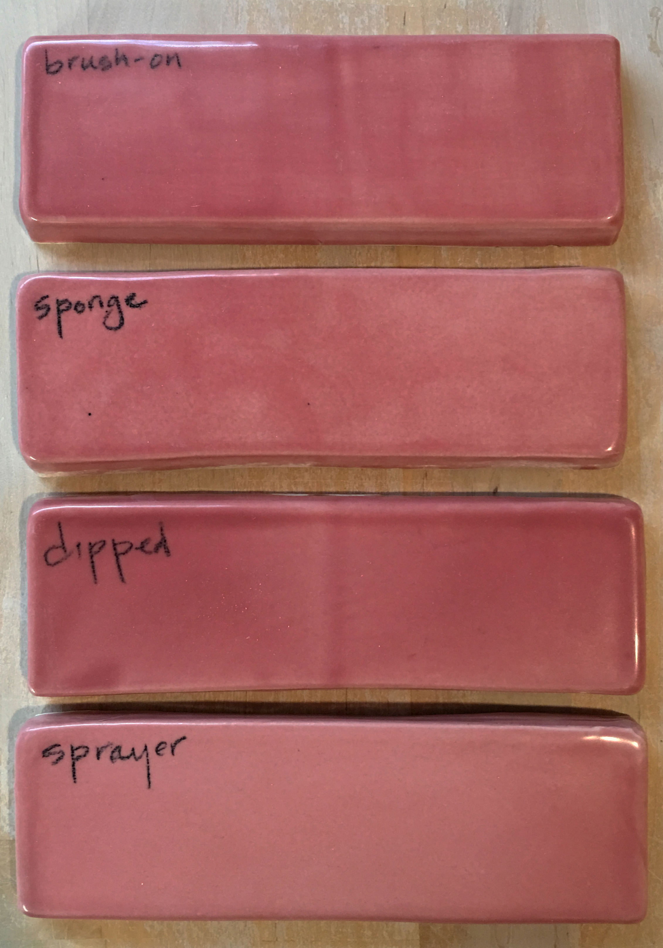
In the meantime, glaze studies continue. I purchased an airbrush (Badger Air-Brush Co 250-1 Basic Spray) a few weeks ago. I’ve been disappointed by the streakiness of some of my glazes so I thought it was worth a try. I was concerned that ceramic glazes might be be too thick and granular to get through an airbrush but by thinning the glaze with about equal amounts of glaze and water, I’ve had no problems. So far I’m really happy with the results.
I’ve also continued exploring the Amaco celadon glazes. Big difference in layering and mixing these (see above). I’m currently firing the walrus tiles shown here using a combination of mixed and layered glazes. Let’s hope my luck turns around!


This past month I’ve focused alot of attention on testing glazes. I’m still not entirely comfortable with using colored glazes on my tiles and vessels. But this is the year of conquering my fears so I think it’s time to start addressing the issue.
My biggest problem with colored glazes is their unpredictable nature. This can sometimes lead to nice surprises but more often than not, I’ve been disappointed by them. The most common problem: they obscure details. When one has worked hours on carving or sculpting a piece, it’s a drag to see a glaze smother the effort.
The good news is that I’ve discovered a line of celadon glazes from Amaco http://www.amaco.com/t/glazes-and-underglazes/high-fire/celadons. I’m not sure how long these have been around but I wish that I’d known about them sooner. There are two things that I really like about these glazes. The first is that my favorite glaze (aside from clear) is Potter’s Choice Celadon PC-40. It’s the beautiful bluish green glaze that I use on most of my tiles in photographs. The reason I like it for my work is that it pools in lines, accentuating rather than obscuring detail. While I love the color of true celadon, I’m glad there are other color options that will give the same effect.
The second reason I like these glazes is that they’re mixable. This might not seem like a big deal but it really is. Mixing colors in most mediums is a fairly straight forward process. Not so with glazes. In the past, mixing two glazes would usually result in something completely unexpected and frequently undesired. Being able to blend colors, as well as, creating tints and shades is very exciting.


We recently returned from an amazing road trip to San Francisco. Along the way we stopped at Point Arena Tileworks pointarenatileworks.com owned by artist Matt Matijczyk. Matt was kind enough to break away from mixing his glazes to chat with us about his work. He’s had his shop for years and has done a few commissions but mainly he makes his living by selling tiles to travelers on the Pacific Coastal Highway.


In an effort to better utilized cabinet space, I’ve modified my original porcelain tea cup design with bases that allow the cups to be stacked. These cups also have a wider band of clear glaze at the lip for easier cleaning. It’s also been fun to experiment with some new tessellation stamps. My next project will be designing a mug with an integral handle. I’ve got some ideas on paper – looking forward to seeing if they’ll work in clay.

A few weeks ago I started working on a series of stackable cups. After experimenting with the simple geometric and more complex tessellation stamps I made last year I thought it was time to get back into doing some figurative work. I decided to translate my tessellation tiles into stamps. I’ve considered doing this for a long time but resisted because I thought it would be too hard to carve enough detail into the stamps to read well (the stamps are about the size of a quarter). Thankfully, carving detail wasn’t a problem. Whether or not they’ll read well (in reverse) when pressed into the slabs remains to be seen. Fingers crossed.


Last year I got a message in my inbox from children’s book author Bruce Goldstone. He has published several beautifully illustrated books that entertain and educate children on a variety of topics including math concepts. Bruce came across this blog while researching tessellations for a book on patterns. He asked me if he could include one of my tile designs. The book, which discusses patterns in nature, art, and design, came out great! I was honored to be included.


Yikes – I haven’t posted anything since Mother’s Day! With the kids home during summer vacation, there hasn’t been much time for clay work or blogging. In an effort to keep things moving, I thought I’d post a couple of “before” photos of what will someday be my new studio. As you can see, it currently serves as our laundry room/donation collection center. The plan is to build some walls and a door around the washer and dryer leaving enough space for a long narrow work area that will take advantage of the existing natural light. It will be smaller than my former studio but I think, if designed efficiently, it could be even better. Stay tuned…


…it’s August 18 and work has begun. We have the walls built. The studio and laundry room are officially two separate areas!


…it’s September 24 and the basic room layout is done. Time to clean things up and organize supplies.